
Janet Jackson
20 Y.O. Album Art
When I found out I won the official Janet Jackson “20 Y.O.” album art competition and that a quarter of a million of my design would be produced as THE album art on packaging… I screamed, I cried.. and then walked into my boss’s office and told him I might have to quit advertising because I “don’t think it’s gonna get and better than this.”
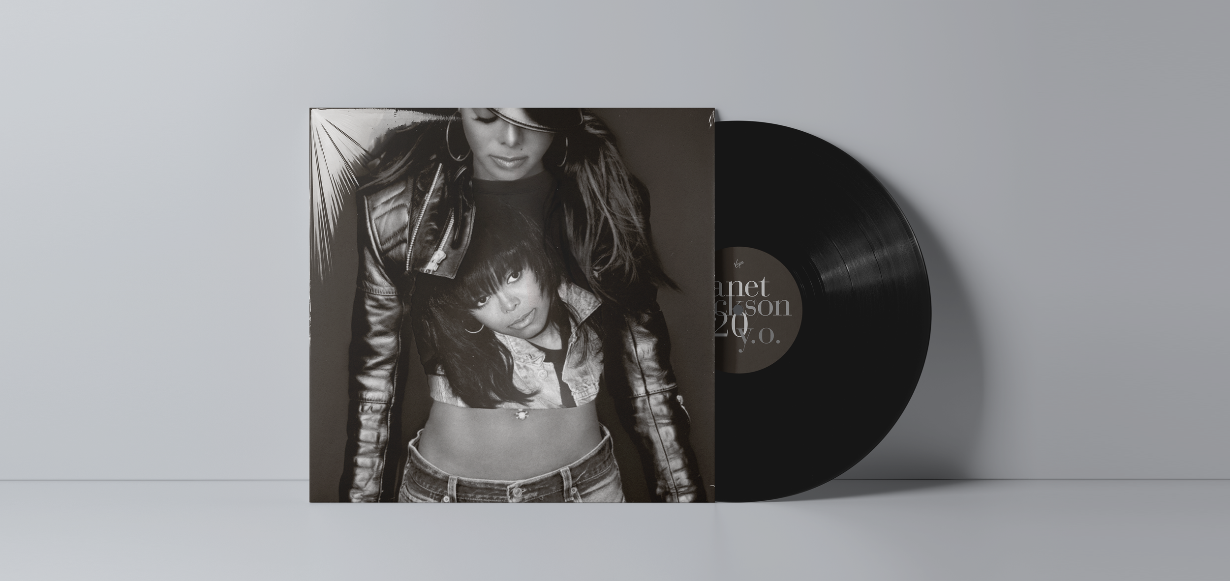
20 Y.O. stands for “20 years old.” Janet said she wanted to mark her 20 years in the biz with this new album, while at the same time she said during the recording she felt like lighter, more free, like she was “20 years old again.” I wanted to hit both that “reflection” angle and also that sense of her feeling like/being a 20 year old. My concept was simple. Put her in a an old rock tee of herself. I knew she was 20 when she did the Pleasure Principle video. And the photos of her in that era are stunning. Janet loved the concept and the rest is history.


This will always be, hands down, one of my favorite experiences as a designer. Especially when the promo began. Seeing how other fans reacted, seeing her on television talk about the design… it still completely blows my marbles.

